China at its best !
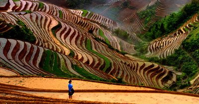
Forget everything you think you know about China and take a couple of minutes to ponder these spectacular images. China has just about everything you want to see.
Very clever photography indeed.
Photographer: Feng Jiang.


[ Forwarder : Ms. Sudha Venkatesan ]
It's submitted for a contest to write a fictional story for 500 words max which would start with the line "On a dark and foggy night, a small figure lay huddled on the railway tracks leading to the Bangalore station"
This is the award winning story !!!!!

My current FF theme:
- Deli.cio.us (Open Source social bookmarking service)
- Web Developer (a toolbar with various web developer tools)
- IE Tab (Embedding Internet Explorer in tabs of Mozilla/Firefox)
- SessionSaver (Restores browser -exactly- as you left , every startup)
- Downthemall ( Downloader, but i use IDM v5.2)
- Flashblock (Blocks swf in frames, iframes and standalone Flash swf files)
- Adblock ( content filtering plug-in )
- Aardvark (CSS Developer tool)
- stylish (To manage CSS rules to change the appearance of web sites)
- MyStickies (To place sticky notes all over the web and organize them)
- PDF Download (To view a PDF file inside the browser, as PDF or HTML)
- Sage ( For RSS feeds)
- Deepest Sender ( Blogging extension)
Whiteheart ( simple & clean: the way i like it !)
More than 77 per cent of people were aware of the importance of washing hands, only 47.9 per cent actually bothered to wash them. The survey, carried out by the Korea Consumer Protection Board, found most of these commonly used mouse/public toilet handles spread of infectious diseases...Health concerned ? Try this link here.
The Dirty Half Dozen:
1. Shopping cart handles - 1100 CFU* per 10 sq cm
2. Internet café computer mouse - 690
3. Bush hand straps - 380
4. Public toilet handles and door knobs - 340.
5. Lift buttons at 130
6. Train hand straps - 86
*CFU-Colony Forming Units.

PS: Ruby is a elder sister of Miro. Hope you've visited him in my previous blogs.
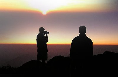
It's my small criss-cross write in Kannada after hearing a lot about the beauty of Kodachadri from my frenz, who had been to this peak recently.
And we're seriously planning for a excursion !
Kodachaadri:
This is the highest peak in Shimoga District, Karnataka/India. At the peak it's believed that 'Shankaracharya' did meditation. And to substantiate the same you will find a 'Sarvajna Peetha' at the top. En route to the peak you will also find a moderate sized water fall deep inside the evergreen forest of Kodachadri, which is called 'Agastya Teertha'. The peak presents a not to be missed life-time opportunity in the evening as the sun sets in the west. The sunset showcases the sexy orange tinged sky view on the peak ! You can also have a golden glimpse of the Arabian sea for a moment.
It’s a tiny chip from my busy UI work station.
Telecom rocks everywhere, especially when it's wireless. True, it's a hot segment. Life is barren minus communication. Pardon granted to network jamming in
Reason was simple. It looks like a legacy design with a marginal effort on styling & presentation. It resembles 3.1 window interface in a neo era of dynamic applications. It seems technology arrived prior to design in choked interface, aborted usability, hard coded xhtml & forbidden CSS ! Obviously, It was designed way back in '97, where UI designing has less prominence over functionality. Till date only functional updates are upfront. As a result usability & accessibility lacks to the core. But in P/L margins it's a best- of-the-breed in the par-applications segment. It's packed with tight application framework and vested with powerful technology available around.
Interestingly, it's built by one of the finest software firms of
In placid words, it's nothing new. It's a common phenomenon that applications very frequently undergo re-skining. Instantly, the query birthed like a tiny bug inside me and started nagging in 24/7 ishtyle*.
Why ? even the saddest looking applications do better business contrary to impressive ones. Why uglier the better? Why users hardly raise a flag against interface-less apps. What matters a most? The so-called 'Goodwill' factor Or the intelligent brand strategy? Comprimising nature for a good service or a strategic marketing of the company? Lack of know-how on clean UI or not bothering about it at-all? Why Slashdot rocks? Is it because of content or speed ? What matters most ?
Today, all these doubts're resolved with this nicety blog of Aaron. It's a must read simple post if you're using Gmail & Microsoft etc & STILL have queries about the sloppy interfaces.
* style, manner, in a way.

 Posts
All Comments
Posts
All Comments

